ATTUNE
A calm-technology wellness app that responds to how users feel and offers supportive suggestions.
Role:
UX Research & Interaction Design
Skills:
Figma UX Research Emotional UX Prototyping
Background +xContext
Many wellness apps are built around structure (streaks, reminders, progress). I’ve used these tools during difficult periods, hoping they’d help me stay afloat, but often found them emotionally mismatched to what I actually needed.
When I felt low, the apps kept asking for consistency. When I felt okay, they still pushed the same routines. Over time, I became more interested in what these tools weren’t doing: listening.
Attune grew out of that gap. It explores a wellness experience that responds to mood first, offering support that adjusts rather than insists.
User Insights
To understand how people wanted wellness apps to respond to emotion,
I surveyed 50+ users and conducted usability testing with 5 participants.
One clear pattern emerged: people want wellness tools that adapt to how they feel, not push for the same response.
Key insights:
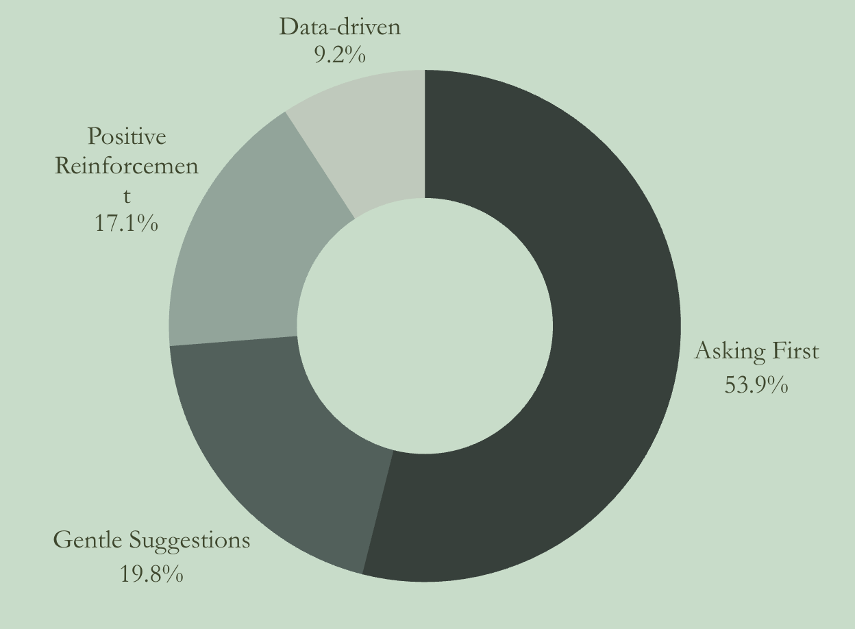
Users preferred apps that ask how they’re feeling first, rather than assuming they’re always trying to improve or “do better.”
During stress or low moods, people wanted gentle, grounding suggestions instead of tasks, goals, or pressure.
When feeling happy or motivated, users appreciated positive reinforcement and light encouragement to maintain that state.
Many found existing wellness apps too data-driven and emotionally “tone-deaf,” reacting the same way regardless of mood.
Overall, users valued experiences that feel emotionally aware, supportive, and responsive in the moment.
Problem
How might we…
design a wellness app that listens to how users feel and responds accordingly, rather than pushing the same routines regardless of emotional state?
II.
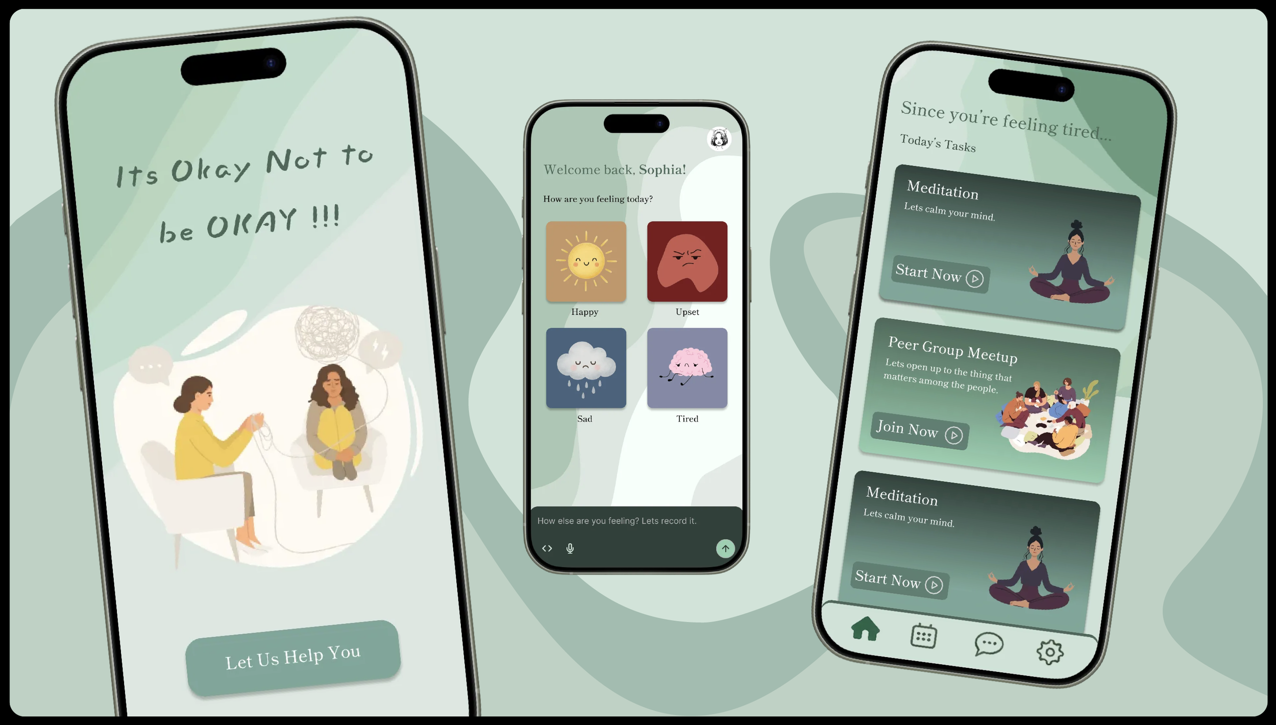
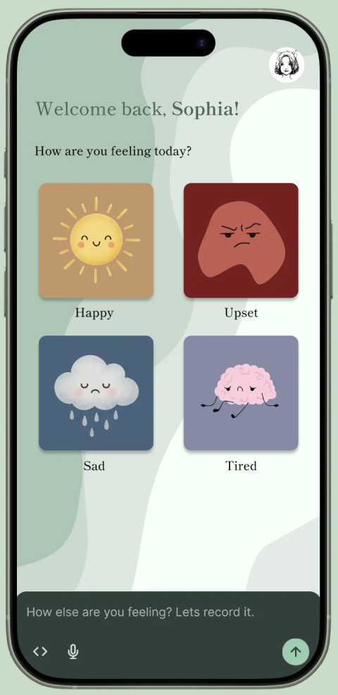
This screen shifts the interaction from reassurance to listening. Instead of assuming what the user needs, Attune asks how they’re feeling and lets emotional input guide the experience.
The mood options are visual and intuitive, reducing the effort required to reflect or explain. By centering emotion as the first decision, the app communicates that how the user feels matters more than what they’ve done.
Solution
I built Attune’s high-fidelity prototype in Figma.
I.
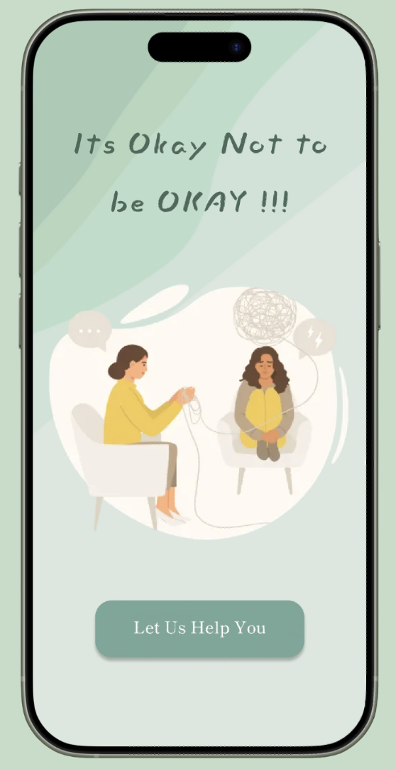
This screen establishes the emotional tone of Attune. Instead of opening with goals or instructions, the app leads with reassurance: “It’s okay not to be okay.”
The illustration and soft color palette are designed to feel calm and non-judgmental, signaling that users don’t need to perform or improve to engage. The single call-to-action invites users in gently, framing support as something offered rather than required.
III.
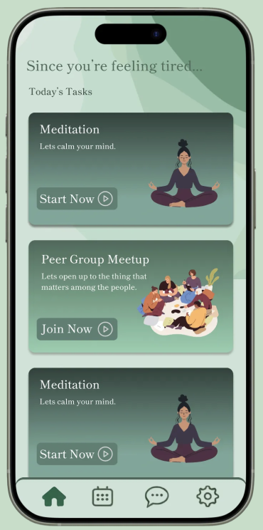
Once a mood is selected, Attune responds with suggestions tailored to that emotional state. Rather than presenting a to-do list, the app offers gentle options—such as calming activities or social support—that users can choose from without pressure.
The language, pacing, and visuals remain soft and flexible, reinforcing the idea that support should adapt to the user, not the other way around.